How to Choose Art Prints for Your Home — A Complete Buying Guide
Choosing art prints for your home can feel overwhelming. With thousands of options online and in stores, how do you know which pieces will actually work in your space? Whether you’re decorating your first apartment or refreshing your living room, this guide will walk you through everything you need to know to choose art prints that you’ll love for years to come.
Art prints are one of the most accessible ways to add personality and style to your home. Unlike original artwork, prints are affordable, easy to swap out, and available in every style imaginable. But the key to creating a cohesive, beautiful space isn’t just about picking pretty pictures—it’s about understanding your style, your space, and what makes a quality print worth buying.
In this guide, you’ll learn how to identify your personal style, choose the right size and orientation, understand print quality and materials, find reputable sellers, and avoid common mistakes that lead to buyer’s remorse.
WHY ART PRINTS MATTER IN HOME DECOR
Art prints are more than just decoration—they’re a reflection of your personality and a way to create atmosphere in your home. The right art can make a small room feel larger, add warmth to a minimalist space, or serve as a conversation starter when guests visit.
Unlike furniture or paint colors, art is deeply personal. It’s one of the few elements in your home that can truly express who you are, what you love, and what inspires you. Whether you’re drawn to abstract shapes, vintage botanical illustrations, or modern photography, your art choices tell a story.
Art prints also offer flexibility. If you rent or move frequently, prints are easy to take with you. If your style evolves, you can swap them out without a major investment. This makes them perfect for anyone who wants to experiment with their decor without commitment.
Finally, art prints are accessible. You don’t need to visit galleries or spend thousands of dollars to own beautiful artwork. Online marketplaces and independent artists have made it possible to find high-quality prints at every price point.
STEP 1: IDENTIFY YOUR PERSONAL STYLE
Before you start shopping, take time to understand your aesthetic preferences. This will help you choose prints that feel cohesive and intentional, rather than random or mismatched.
Start with your existing decor. Look around your home. What colors dominate your space? Is your furniture modern or traditional? Do you gravitate toward clean lines or more ornate details? Your art should complement—not clash with—your existing style.
Create a mood board. Use Pinterest, Instagram, or even magazine clippings to collect images of rooms and art that appeal to you. After gathering 20-30 images, look for patterns. Do you prefer black and white or color? Abstract or representational? Minimalist or maximalist?
Consider your lifestyle. If you have young children, you might want to avoid glass frames at eye level. If you love bold colors in your wardrobe, you might enjoy vibrant art. If you prefer calm, neutral spaces, look for subtle, soothing prints.
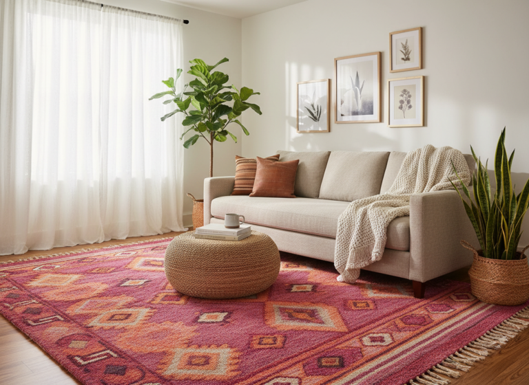
Think about the mood you want to create. Art has emotional impact. Soft watercolors create serenity. Bold geometric prints add energy. Vintage botanical illustrations bring a sense of history and nature indoors. Choose prints that support the atmosphere you want in each room.
STEP 2: CHOOSE THE RIGHT SIZE AND ORIENTATION
Size matters more than most people realize. A tiny print on a large wall will look lost and insignificant. An oversized print in a small room can feel overwhelming.
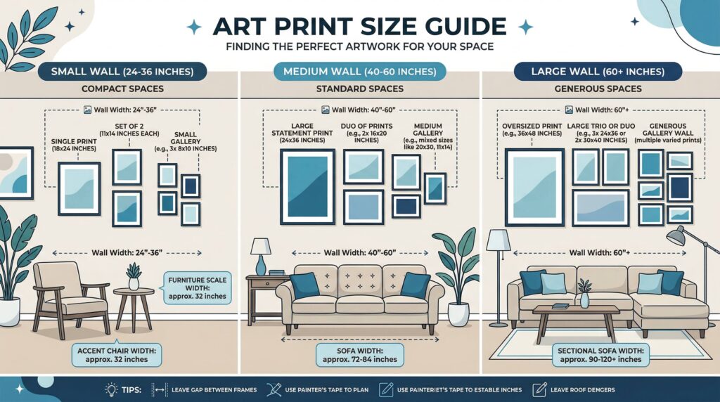
Measure your wall space. Before shopping, measure the width and height of the wall where you plan to hang your print. A good rule of thumb: your art should take up 60-75% of the available wall space. For example, if you have a 60-inch wide wall, look for art that’s 36-45 inches wide.
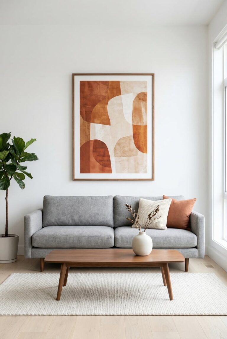
Consider furniture scale. If you’re hanging art above a sofa, console table, or bed, the print should be roughly two-thirds the width of the furniture piece. This creates visual balance and makes the arrangement feel intentional.
Vertical vs. horizontal orientation. Vertical (portrait) prints draw the eye upward and make ceilings feel higher—perfect for narrow walls or small rooms. Horizontal (landscape) prints make walls feel wider and work well above sofas or in dining rooms. Square prints are versatile and modern, ideal for gallery walls.
Don’t forget about matting and framing. A mat adds 2-4 inches to each side of your print, and the frame adds another 1-2 inches. Always account for this when measuring. A 16×20 inch print can become 24×30 inches once matted and framed.
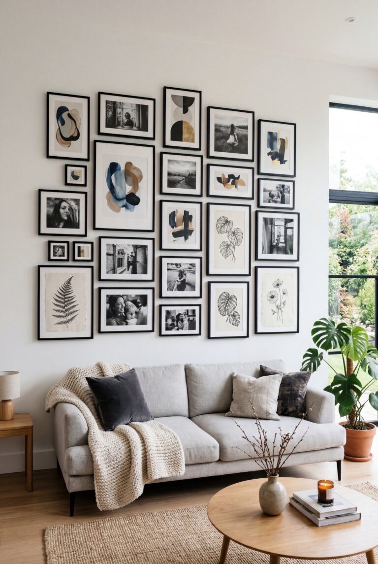
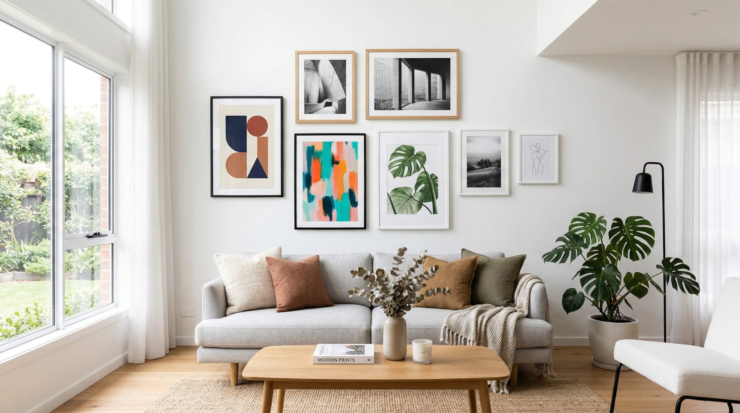
Multiple prints vs. single statement piece. A single large print creates a focal point and feels sophisticated. Multiple smaller prints (gallery wall style) add visual interest and let you mix styles. Choose based on your wall size and personal preference.
STEP 3: UNDERSTAND PRINT QUALITY AND MATERIALS
Not all prints are created equal. Understanding quality markers will help you avoid disappointment and ensure your prints look beautiful for years.
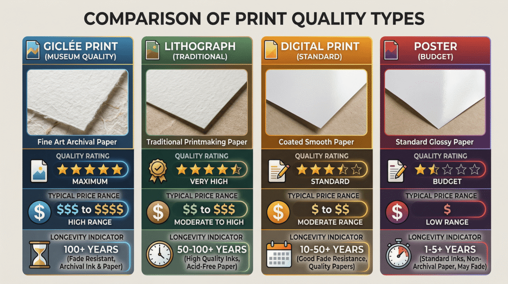
Print types explained:
- Giclée prints : High-quality inkjet prints on archival paper or canvas. Museum-grade, fade-resistant, and the gold standard for art prints. Expect to pay more, but they’re worth it for pieces you plan to keep long-term.
- Lithographs: Traditional printing method using stone or metal plates. Often used for limited editions. High quality but less common for home decor prints.
- Digital prints: Standard inkjet or laser prints. Quality varies widely depending on the printer and paper. Fine for budget-friendly decor, but may fade faster.
- Posters: Mass-produced prints, usually on thin paper. Affordable but lower quality. Best for temporary decor or kids’ rooms.
Paper quality matters. Look for acid-free, archival-quality paper rated at 200gsm or higher. This prevents yellowing and ensures longevity. Cotton rag paper (used for giclée prints) is the highest quality and has a beautiful texture.
Canvas prints. Canvas creates a gallery-wrapped, frameless look that’s modern and casual. However, canvas prints can be harder to clean and may sag over time if not properly stretched. They work best for abstract or painterly images.
Check the DPI (dots per inch). Professional prints should be at least 300 DPI. Anything lower will look pixelated or blurry, especially in larger sizes. Reputable sellers will always list DPI in their product details.
Limited editions vs. open editions. Limited edition prints are numbered (e.g., 25/100) and often signed by the artist, making them more collectible and valuable. Open editions have no production limit and are more affordable. Choose based on your budget and whether you care about collectibility.
STEP 4: FIND REPUTABLE SELLERS AND ARTISTS
Where you buy matters. Choosing reputable sellers ensures you get quality prints, accurate colors, and good customer service.
Online marketplaces:
- Etsy: Great for independent artists and unique, one-of-a-kind prints. Read reviews carefully and check shop policies.
- Society6: Curated collection of artist-designed prints. Quality is consistent, and artists receive fair compensation.
- Minted: High-quality prints with a focus on design. Offers framing services and excellent customer support.
- Artfully Walls: Affordable art prints with a modern aesthetic. Good for renters and budget-conscious decorators.
Buy directly from artists. Many artists sell prints through their own websites or Instagram shops. This supports creators directly and often means better prices. Look for artists whose style resonates with you and follow them on social media.
Museum shops and galleries. Museum reproduction prints are high quality and often feature classic works. Galleries offer original prints and limited editions, though prices are higher.
Avoid red flags:
- No return policy or vague shipping information
- Stock photos instead of actual product images
- Prices that seem too good to be true (often indicate low quality or stolen artwork)
- No information about print materials or DPI
Read reviews and ask questions. Before purchasing, read customer reviews about print quality, color accuracy, and shipping. Don’t hesitate to message sellers with questions about materials, sizing, or customization.
STEP 5: COORDINATE COLORS AND THEMES
Creating a cohesive look requires thoughtful color and theme coordination. Your art should enhance your space, not compete with it.
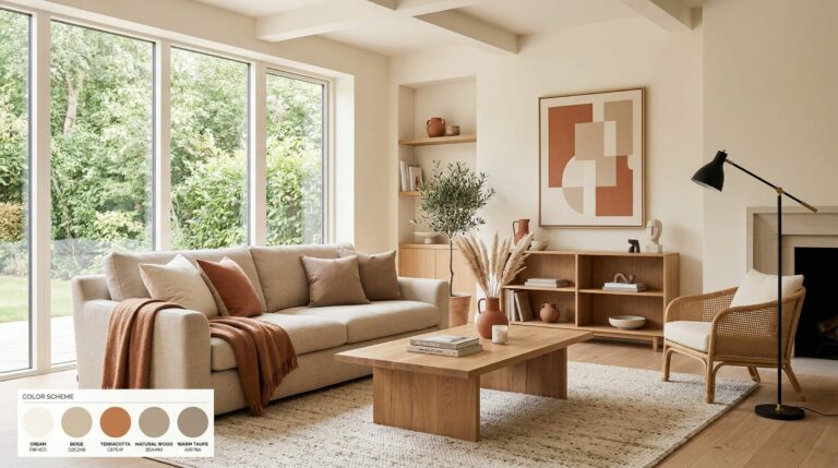
Pull colors from your existing palette. Choose prints that include at least one or two colors already present in your room (in furniture, pillows, rugs, or walls). This creates visual harmony and makes the space feel intentional.
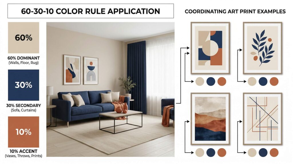
Use the 60-30-10 rule. In any room, 60% should be your dominant color (walls, large furniture), 30% your secondary color (accent furniture, curtains), and 10% your accent color (pillows, art, accessories). Your art can reinforce any of these layers.
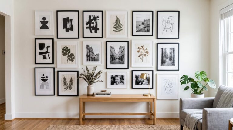
Monochromatic vs. colorful. Black and white prints are timeless, versatile, and easy to coordinate. They work in any room and never go out of style. Colorful prints add energy and personality but require more careful coordination.
Stick to a theme—loosely. You don’t need all your art to match perfectly, but having a loose theme (e.g., botanical, abstract, vintage travel posters) creates cohesion. Mix styles within that theme for visual interest.
Consider the room’s purpose. Calming, neutral art works well in bedrooms. Bold, energetic prints suit living rooms and home offices. Playful, colorful art is perfect for kids’ rooms or creative spaces.
Test before you buy. Many sellers offer digital previews or allow returns. If possible, order samples or use visualization tools to see how the print looks in your space before committing.
COMMON MISTAKES TO AVOID
Even with the best intentions, it’s easy to make mistakes when buying art prints. Here are the most common pitfalls and how to avoid them.
Buying art that’s too small. This is the #1 mistake. When in doubt, go bigger. Small art on a large wall looks insignificant and unfinished.
Ignoring your existing decor. Falling in love with a print is great—but if it clashes with your furniture or color scheme, you’ll regret it. Always consider context.
Choosing trendy over timeless. Trends come and go. If you’re investing in quality prints, choose pieces you’ll love in five or ten years, not just what’s popular on Instagram today.
Forgetting about framing costs. A $30 print can easily become a $150 investment once you add a quality frame and mat. Budget for framing from the start.
Hanging art too high. The center of your art should be at eye level (57-60 inches from the floor). Hanging too high makes rooms feel disconnected and awkward.
Not considering lighting. Art needs proper lighting to shine. Avoid hanging prints in direct sunlight (which causes fading) or in dark corners where they won’t be seen.
Buying everything at once. Building an art collection takes time. Start with one or two key pieces and add gradually. This prevents impulse purchases and allows your style to evolve naturally.
FRAMING AND DISPLAY OPTIONS
How you frame and display your prints is just as important as the prints themselves. The right framing enhances your art and protects it for years to come.
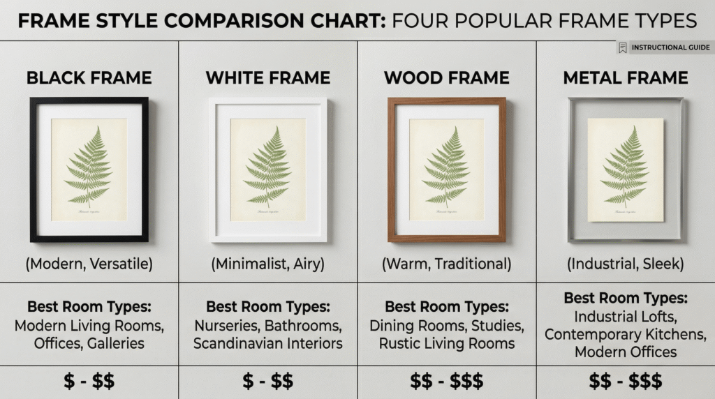
Frame styles:
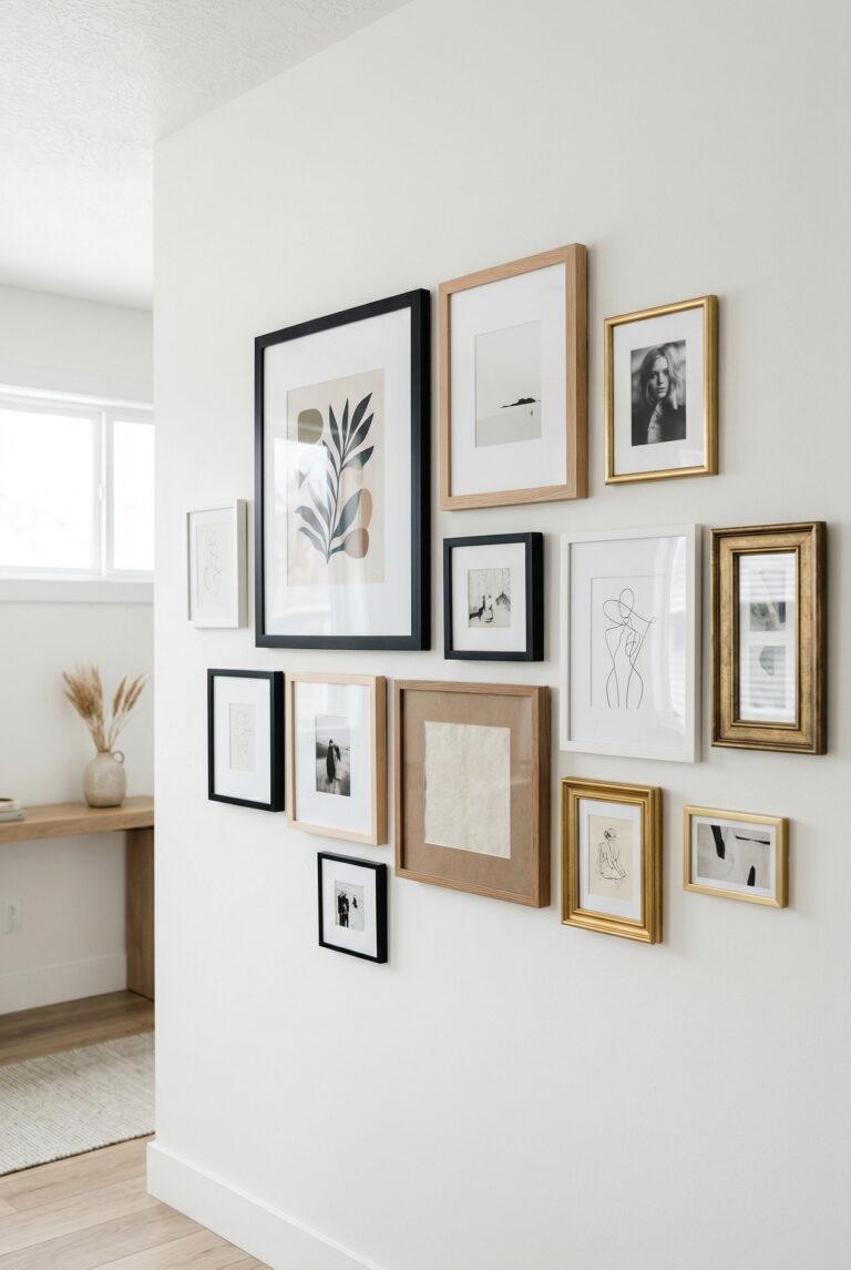
- Black frames: Classic, versatile, and modern. Work with any decor style and make colors pop.
- White frames: Light, airy, and Scandinavian. Perfect for minimalist spaces and beach-inspired decor.
- Wood frames: Warm, natural, and traditional. Great for botanical prints, landscapes, and rustic interiors.
- Metal frames: Sleek, contemporary, and industrial. Ideal for modern art and urban spaces.
Matting adds polish. A mat (also called a mount) creates space between the print and frame, giving your art a gallery-quality look. White and off-white mats are most common, but colored mats can add a creative touch.
Glass vs. acrylic. Glass is traditional, affordable, and provides excellent clarity. Acrylic (plexiglass) is lighter, shatter-resistant, and better for large prints or homes with children. UV-protective glass or acrylic prevents fading.
Gallery wall tips. If you’re creating a gallery wall, lay out your arrangement on the floor first. Aim for 2-3 inches of space between frames. Mix frame sizes and orientations for visual interest, but keep frame colors consistent (all black, all white, or all wood).
Frameless options. For a modern, minimalist look, consider floating frames (where the print appears to float within the frame) or simply clip prints to the wall with binder clips or washi tape. This works especially well for temporary or rotating displays.
BUDGET-FRIENDLY TIPS
You don’t need a huge budget to create a beautiful art collection. Here’s how to find quality prints without breaking the bank.
Start with digital downloads. Many artists sell high-resolution digital files that you can print yourself at a local print shop. This is often 50-75% cheaper than buying pre-printed art.
Shop sales and promotions. Sign up for newsletters from your favorite art sellers. Many offer 20-40% off sales several times a year, especially around holidays.
Frame prints yourself. Pre-made frames from IKEA, Target, or Amazon are affordable and look great. Standard sizes (8×10, 11×14, 16×20) are cheapest and easiest to find.
Mix high and low. Invest in one or two statement pieces and fill in with budget-friendly prints. No one will know the difference once everything is framed and hung.
Rotate your art. Instead of buying new prints constantly, rotate what you already have between rooms. This refreshes your space without spending money.
Support emerging artists. Early-career artists often price their work lower than established names. You’ll get unique pieces at great prices while supporting creators directly.
FINAL THOUGHTS
Choosing art prints for your home is a personal journey. There’s no single “right” way to do it—only what feels right for you and your space. Trust your instincts, take your time, and don’t be afraid to experiment.
Start by identifying your style and measuring your space. Invest in quality prints that will last. Choose colors and themes that complement your decor. Avoid common mistakes like buying too small or ignoring framing costs. And most importantly, choose art that makes you happy every time you see it.
Your home should be a reflection of who you are. Art prints are one of the easiest, most affordable ways to make that happen. Whether you prefer bold abstracts, serene landscapes, or vintage botanical illustrations, there’s a perfect print waiting for you.
Happy decorating!