How to Choose the Perfect Living Room Color Scheme — 5 Timeless Palettes That Actually Work
Choosing the right color scheme for your living room can feel overwhelming. With thousands of paint swatches and endless design inspiration online, where do you even start? The truth is, a successful living room color palette isn’t about following trends—it’s about understanding color theory, your space’s natural light, and how different hues affect mood and perception.
After years of studying interior design and analyzing what makes certain living rooms feel instantly inviting while others fall flat, I’ve identified the core principles that separate amateur color choices from professional-looking results. In this comprehensive guide, I’ll walk you through five timeless color schemes that work in any home, the psychology behind color selection, and the exact framework designers use to create harmonious spaces.
Whether you’re starting from scratch or refreshing an existing room, you’ll learn how to choose colors that not only look beautiful but also enhance your daily living experience.
WHY YOUR LIVING ROOM COLOR SCHEME MATTERS MORE THAN YOU THINK
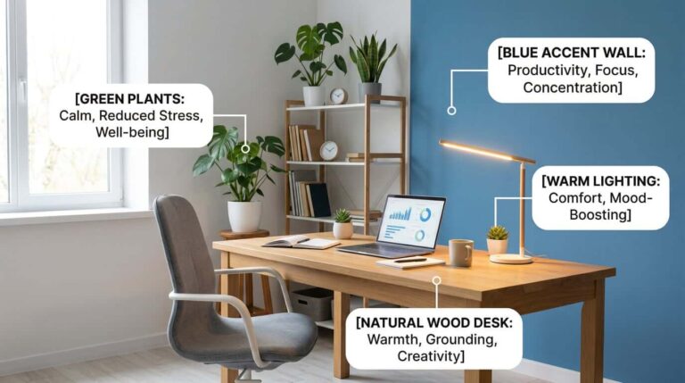
Your living room is the heart of your home—the space where you unwind after work, host gatherings, and spend quality time with family. The colors surrounding you in this space directly impact your emotional state, energy levels, and even how spacious the room feels.
Research in environmental psychology shows that warm colors like terracotta and beige can increase feelings of comfort and social connection, while cool tones like gray and blue promote calmness and focus. But here’s what most people miss: it’s not just about picking “relaxing” colors. The wrong shade of blue can make a north-facing room feel cold and unwelcoming. An all-white palette might photograph beautifully but feel sterile in real life.
The key is understanding how colors interact with your specific space—its size, natural light, existing furniture, and your personal lifestyle. A color scheme that works in a sun-drenched California living room might feel completely different in a cozy Boston brownstone.
THE 60-30-10 RULE: YOUR COLOR SCHEME FOUNDATION
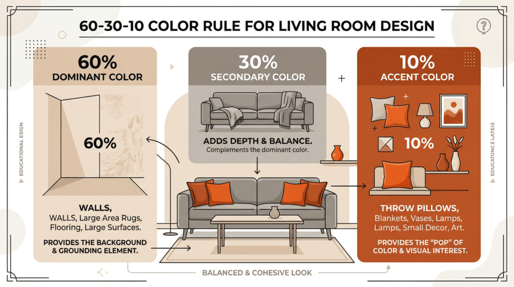
Before we dive into specific palettes, you need to understand the professional designer’s secret weapon: the 60-30-10 rule. This principle ensures your color scheme feels balanced rather than chaotic or monotonous.
Here’s how it works:
- 60% Dominant Color: This is your room’s foundation, typically applied to walls and large furniture pieces like sofas. It sets the overall mood and should be the most neutral or subdued color in your palette.
- 30% Secondary Color: This supports your dominant color and adds visual interest. Think accent chairs, curtains, or a large area rug.
- 10% Accent Color: This is your pop of personality—throw pillows, artwork, decorative objects. This is where you can be bold.
For example, in a warm neutral scheme, you might use creamy beige walls (60%), a warm gray sofa (30%), and terracotta throw pillows and vases (10%). This creates visual hierarchy and prevents any single color from overwhelming the space.
The beauty of this rule is its flexibility. You can apply it to any of the five color schemes I’m about to share, adjusting the specific shades to match your taste and lighting conditions.
5 TIMELESS LIVING ROOM COLOR SCHEMES
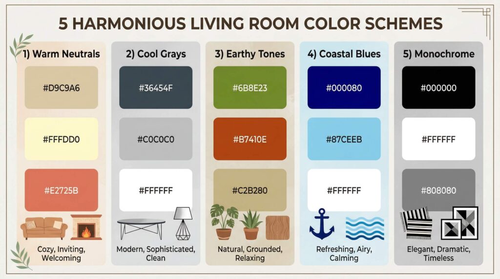
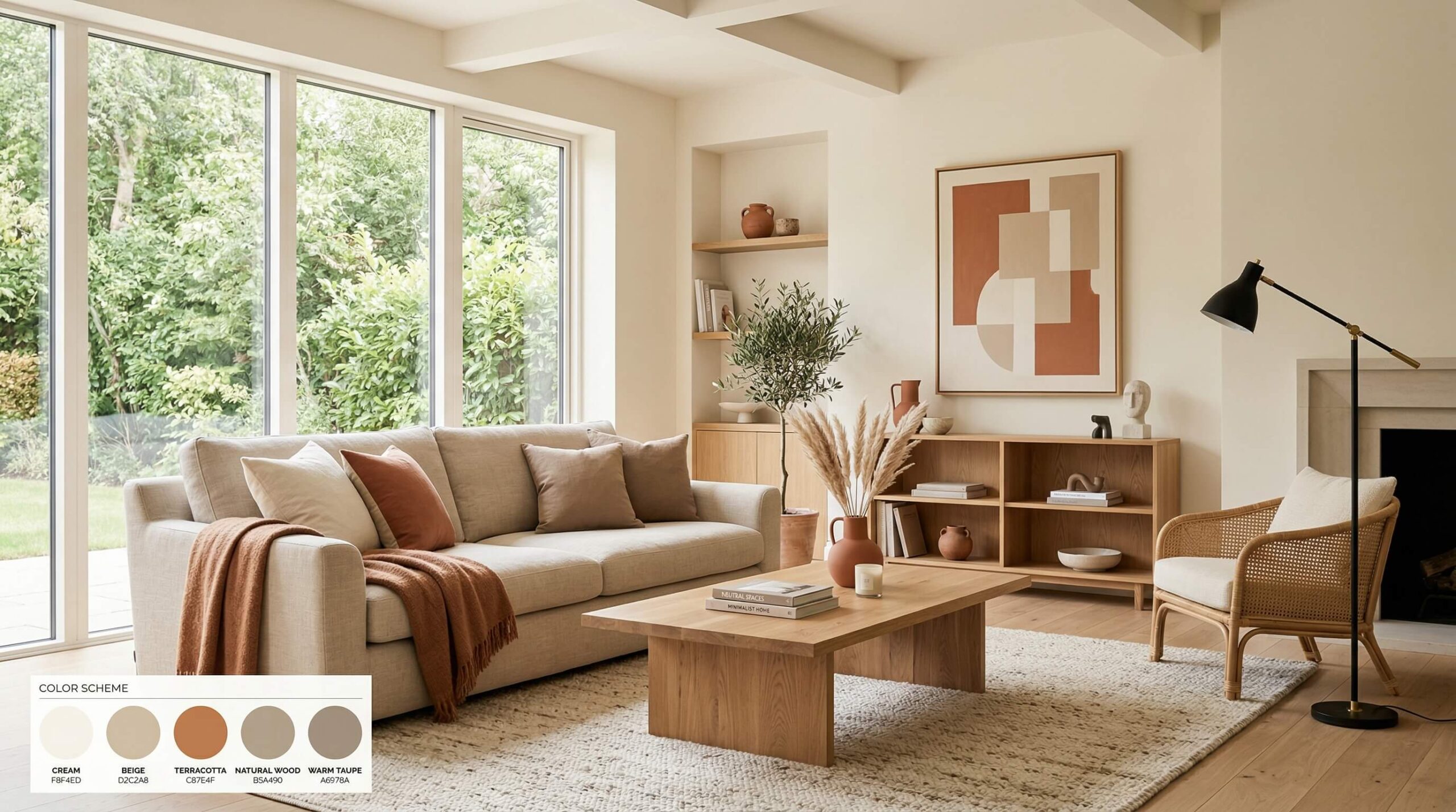
1. Warm Neutrals: The Universally Flattering Choice
Color Palette: Beige, cream, terracotta, warm taupe, soft white
This is the most forgiving color scheme for beginners because warm neutrals work in virtually any lighting condition and complement any design style from modern to traditional. The key to preventing this palette from feeling boring is layering different textures—linen, wool, natural wood, ceramic—and varying the tones from light cream to deeper caramel.
Best for: North-facing rooms that need warmth, small spaces that benefit from light-reflective colors, anyone who wants a timeless backdrop that won’t feel dated in five years.
How to implement: Paint walls in a warm white or light beige (Benjamin Moore’s “Swiss Coffee” or Sherwin-Williams’ “Accessible Beige”). Choose a beige or oatmeal linen sofa. Add terracotta accents through throw pillows, a rust-colored throw blanket, and ceramic vases. Bring in natural wood furniture to enhance the organic, grounded feel.
2. Cool Grays: Sophisticated and Modern
Color Palette: Charcoal, light gray, white, silver metallics, black accents
Gray has dominated interior design for the past decade, and for good reason—it’s incredibly versatile and creates an elegant, contemporary atmosphere. However, gray is also the most misunderstood color. The wrong shade can make your room feel cold, dark, or institutional.
The secret is choosing grays with the right undertones. Cool grays have blue undertones and work best in south-facing rooms with abundant natural light. Warm grays (sometimes called “greige”) have beige undertones and are more forgiving in rooms with limited light.
Best for: Modern or contemporary homes, south-facing rooms with lots of natural light, people who want a sophisticated, gallery-like backdrop for artwork and statement furniture.
How to implement: Paint one accent wall in charcoal gray (Sherwin-Williams’ “Peppercorn”) and keep other walls light gray or white. Choose a light gray sectional sofa. Add depth with black-framed artwork, a plush gray area rug, and metallic accents in silver or brushed nickel. Avoid making the space feel cold by incorporating warm wood tones in your coffee table or shelving.
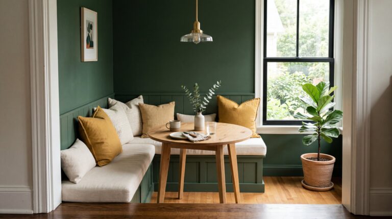
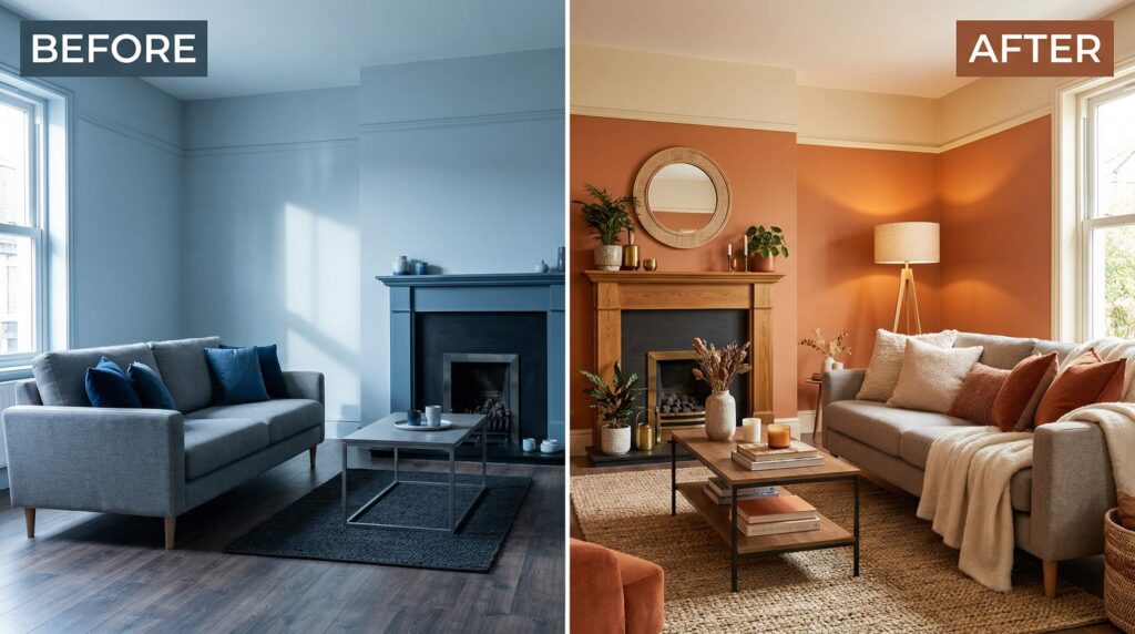
3. Earthy Tones: Organic and Grounding
Color Palette: Olive green, rust, sandy beige, terracotta, warm brown
If you’re drawn to natural materials and bohemian aesthetics, an earthy color palette will make your living room feel like a peaceful retreat. These colors are inspired by nature—think desert landscapes, autumn forests, and sun-baked clay—and they create an inherently calming, organic atmosphere.
This palette works particularly well if you have lots of plants, natural fiber rugs, and wood furniture. The colors complement greenery beautifully and make the space feel connected to the outdoors.
Best for: Homes with lots of natural light, spaces with wood floors or exposed beams, anyone who wants a cozy, bohemian, or organic modern aesthetic.
How to implement: Paint walls in a sandy beige or warm white. Choose an olive green velvet sofa or a rust-colored accent chair. Layer in terracotta through planters, throw pillows, and ceramic decor. Add woven wall hangings, jute rugs, and natural wood shelving to enhance the organic feel.
4. Coastal Blues: Fresh and Serene
Color Palette: Navy blue, sky blue, crisp white, natural wood tones, sandy beige
A blue and white color scheme evokes the calming feeling of being near the ocean, making it perfect for creating a serene, airy living room. The key is balancing cool blues with warm neutrals and natural textures to prevent the space from feeling too cold or nautical-themed.
Navy blue has become a sophisticated alternative to black in modern interiors, providing depth and drama without feeling heavy. Paired with crisp white and lighter blues, it creates a fresh, timeless look that works year-round.
Best for: Homes in warm climates, rooms with lots of natural light, anyone who wants a calming, spa-like atmosphere, coastal or transitional design styles.
How to implement: Paint one accent wall in navy blue (Benjamin Moore’s “Hale Navy”) and keep other walls white. Choose a white slipcovered sofa with sky blue throw pillows. Add natural texture through rattan furniture, a jute rug, and driftwood decor. Incorporate sandy beige through curtains or an accent chair to warm up the cool tones.
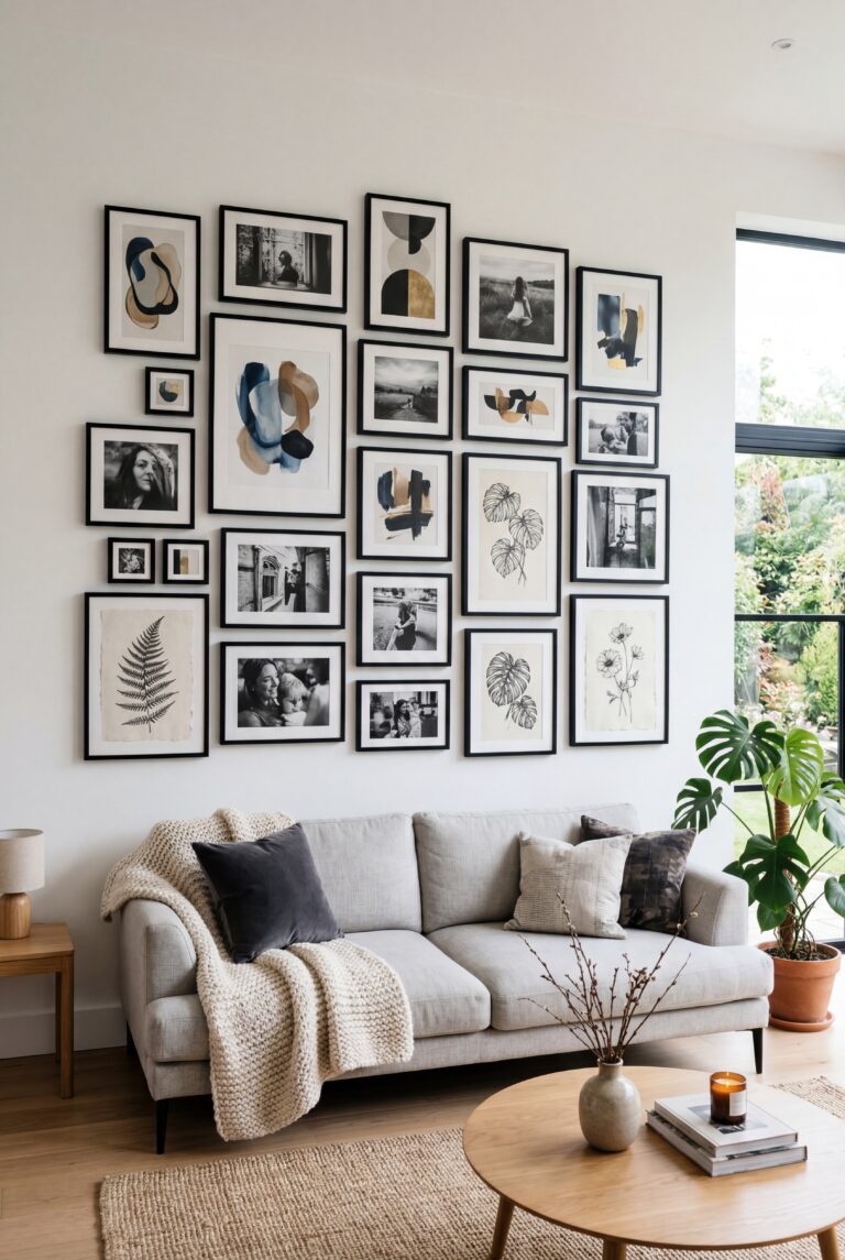
5. Monochrome: Bold and Dramatic
Color Palette: Black, white, charcoal gray, cream
A monochrome color scheme is the ultimate in sophistication and drama. By limiting your palette to black, white, and shades of gray, you create a high-contrast, gallery-like space where furniture, artwork, and architectural details become the focal points.
This palette requires confidence and careful balance. Too much black can make a room feel dark and oppressive, while too much white can feel sterile. The key is layering different shades and incorporating plenty of texture—velvet, leather, wool, marble—to add depth and visual interest.
Best for: Modern or minimalist homes, large rooms with high ceilings, people who want a bold, statement-making space, showcasing colorful artwork or statement furniture.
How to implement: Paint walls white or light gray. Choose a charcoal gray or black sofa. Add contrast with a white marble coffee table, black-framed artwork, and a plush gray area rug. Bring in warmth through natural wood accents and soft textiles like a chunky knit throw blanket.
COMMON COLOR SCHEME MISTAKES (AND HOW TO AVOID THEM)
Even with a solid color palette, execution matters. Here are the most common mistakes I see and how to fix them:
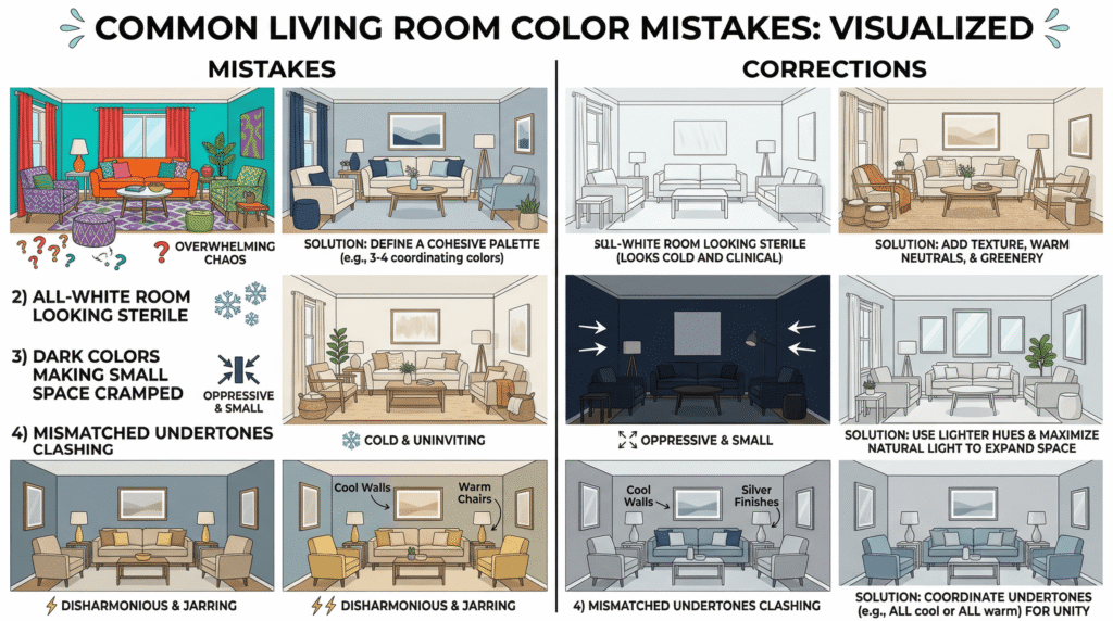
Mistake 1: Too Many Competing Colors
More isn’t better when it comes to color. Stick to 3-4 main colors maximum. If you want variety, vary the shades and tones within your chosen palette rather than introducing entirely new colors.
Mistake 2: Ignoring Undertones
Every “neutral” has an undertone—beige can lean pink, yellow, or gray; white can be warm or cool; gray can have blue, green, or purple undertones. If your colors clash despite being in the same family, it’s likely an undertone mismatch. Always test paint samples in your actual lighting before committing.
Mistake 3: All One Shade
An all-white or all-gray room can look flat and one-dimensional. Create depth by using different shades of your dominant color—light walls, medium furniture, darker accents.
Mistake 4: Forgetting About Lighting
Colors look completely different in natural daylight versus warm artificial lighting. A beige that looks perfect at noon might appear yellow under evening lamps. Test your colors at different times of day before making final decisions.
YOUR ACTION PLAN: CHOOSING YOUR PERFECT COLOR SCHEME
Ready to transform your living room? Here’s your step-by-step process:
- Assess your space: Note the direction your windows face, how much natural light you get, and the size of your room.
- Choose your palette: Select one of the five schemes above based on your lighting, personal style, and desired mood.
- Test before committing: Buy sample pots of your chosen paint colors and test them on your walls. Live with them for a few days, observing how they look in different lighting.
- Apply the 60-30-10 rule: Assign your colors to dominant, secondary, and accent roles.
- Layer textures: Even the most beautiful color scheme needs texture to feel complete. Mix smooth and rough, matte and glossy, soft and hard surfaces.
- Start small: If you’re nervous about commitment, start with accent colors through pillows, throws, and decor. You can always paint walls later once you’re confident in your palette.
The perfect living room color scheme isn’t about following trends or copying what you see on Pinterest. It’s about understanding how color works in your specific space and choosing a palette that makes you feel at home the moment you walk through the door.