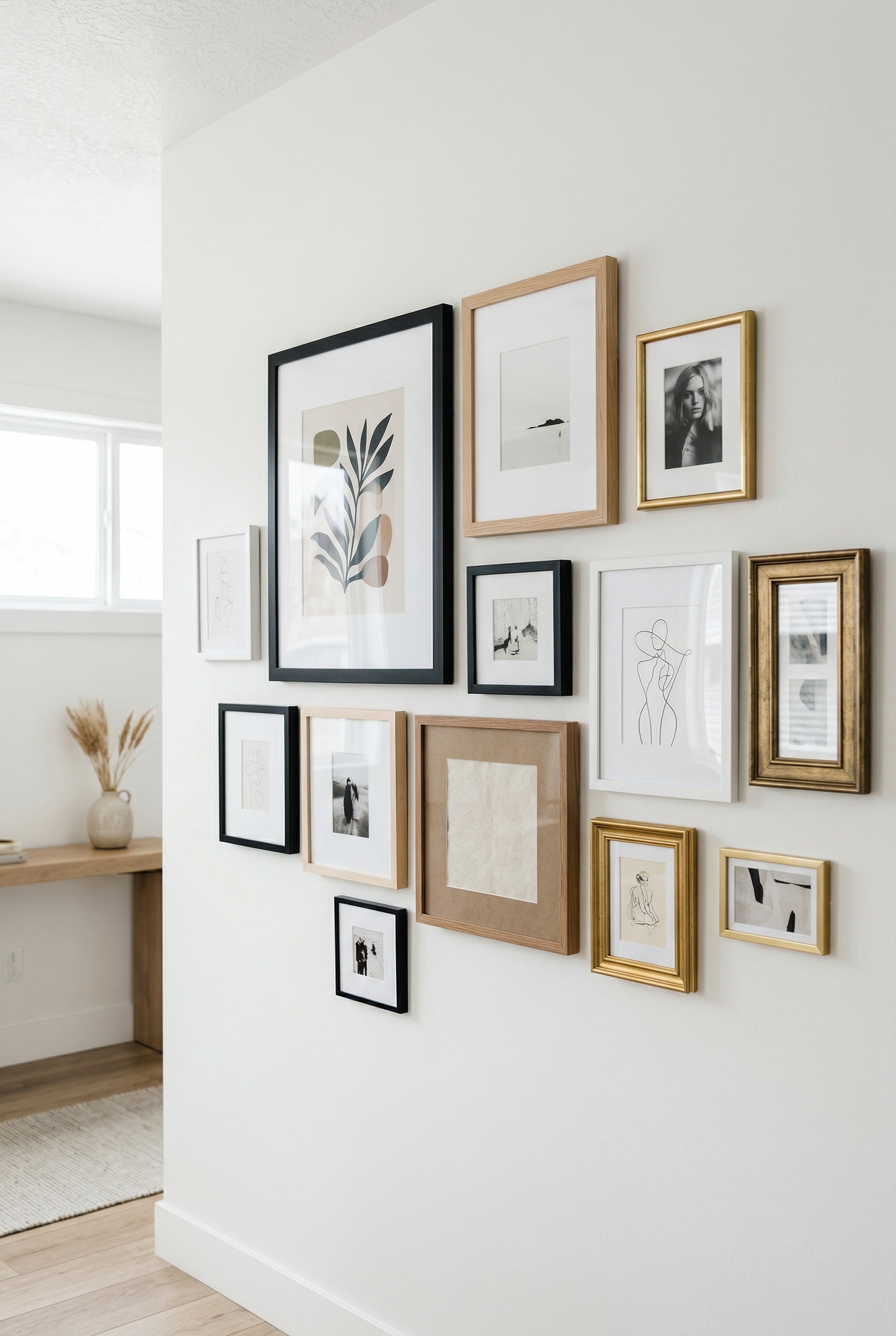
How to Choose Picture Frames — A Complete Guide to Frame Selection
Choosing the right picture frame is like choosing the right outfit. The frame should enhance what’s inside — not compete with it.
But walk into any frame shop and you’ll face hundreds of options: black, white, wood, metal, thick, thin, ornate, minimal. Where do you even start?
Here’s how to choose picture frames that actually work.
FRAME STYLE: WHAT’S YOUR AESTHETIC?
The frame style should match your space — not the other way around.
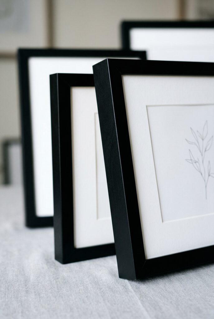
Black Frames
- Best for: Modern, minimalist spaces
- Works with: Black and white photos, line drawings, graphic prints
- Avoid with: Warm, traditional interiors (unless intentional contrast)
Why black frames work:
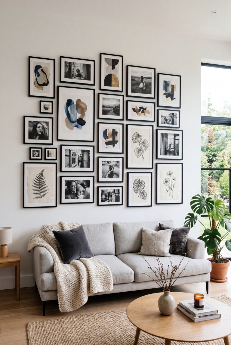
Black creates a strong boundary between the art and the wall. It focuses attention inward. In a gallery wall, black frames create visual cohesion even when the art styles vary.
White Frames
- Best for: Bright, airy spaces; coastal or Scandinavian aesthetics
- Works with: Colorful art, botanical prints, watercolors
- Avoid with: All-white walls (frames disappear)
Why white frames work:
White frames feel light and unobtrusive. They let the art breathe. Perfect when you want the focus entirely on the artwork, not the frame.
Wood Frames
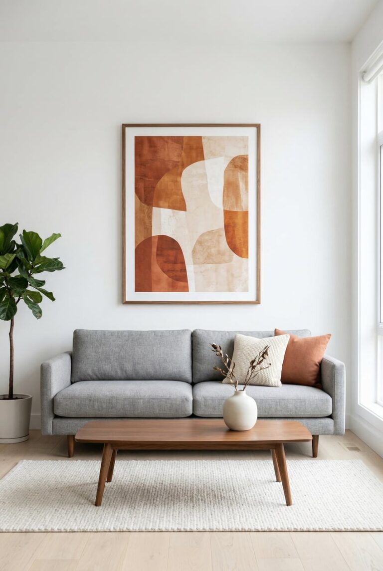
- Best for: Warm, traditional, or eclectic spaces
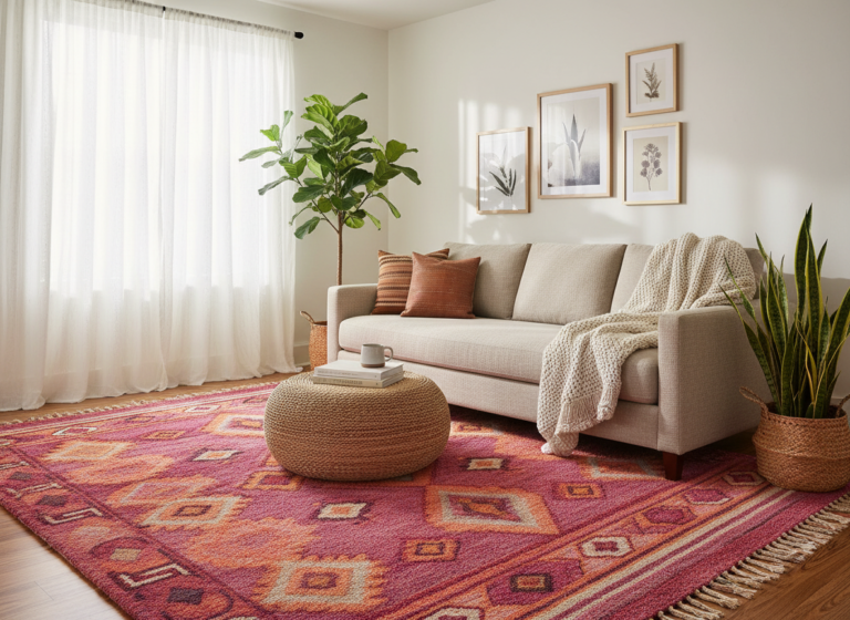
- Works with: Landscapes, vintage photos, nature photography
- Avoid with: Ultra-modern minimalist spaces (unless you want contrast)
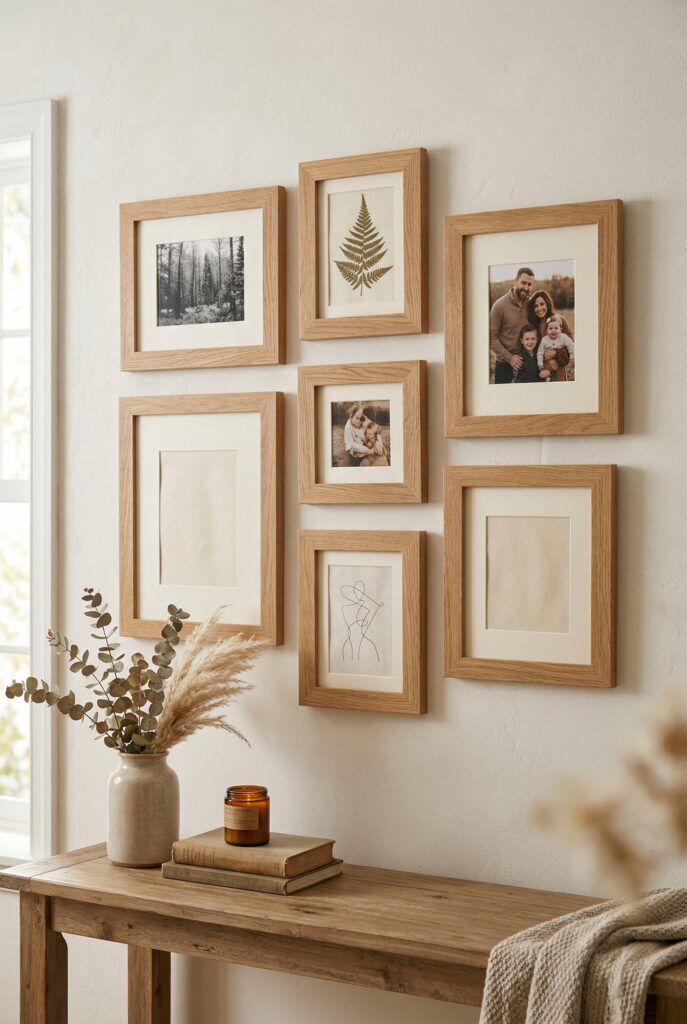
Why wood frames work:
Wood adds warmth and texture. Natural wood grain brings an organic element that softens the geometry of a gallery wall.
Metal Frames
- Best for: Industrial, modern, or gallery-style spaces
- Works with: Photography, abstract art, architectural prints
- Avoid with: Cozy, traditional interiors
Why metal frames work:
Metal frames are sleek and unobtrusive. Thin metal profiles create a floating effect — the art feels like it’s hovering on the wall.
FRAME SIZE: GETTING THE PROPORTIONS RIGHT
The frame should be proportional to both the art and the space.

The 2-inch rule:
For most art, leave at least 2 inches of mat board (or frame width) around the artwork. This creates breathing room and prevents the art from feeling cramped.
Common frame sizes:
- 8×10 inches (small prints, photos)
- 11×14 inches (medium prints)
- 16×20 inches (statement pieces)
- 24×36 inches (large art, posters)
Custom vs. standard sizes:
- Standard sizes are cheaper and readily available
- Custom framing is necessary for odd-sized art or when you want specific mat widths
Pro tip: If your art is an odd size, consider custom matting with a standard frame. This is cheaper than full custom framing.
MAT OR NO MAT?
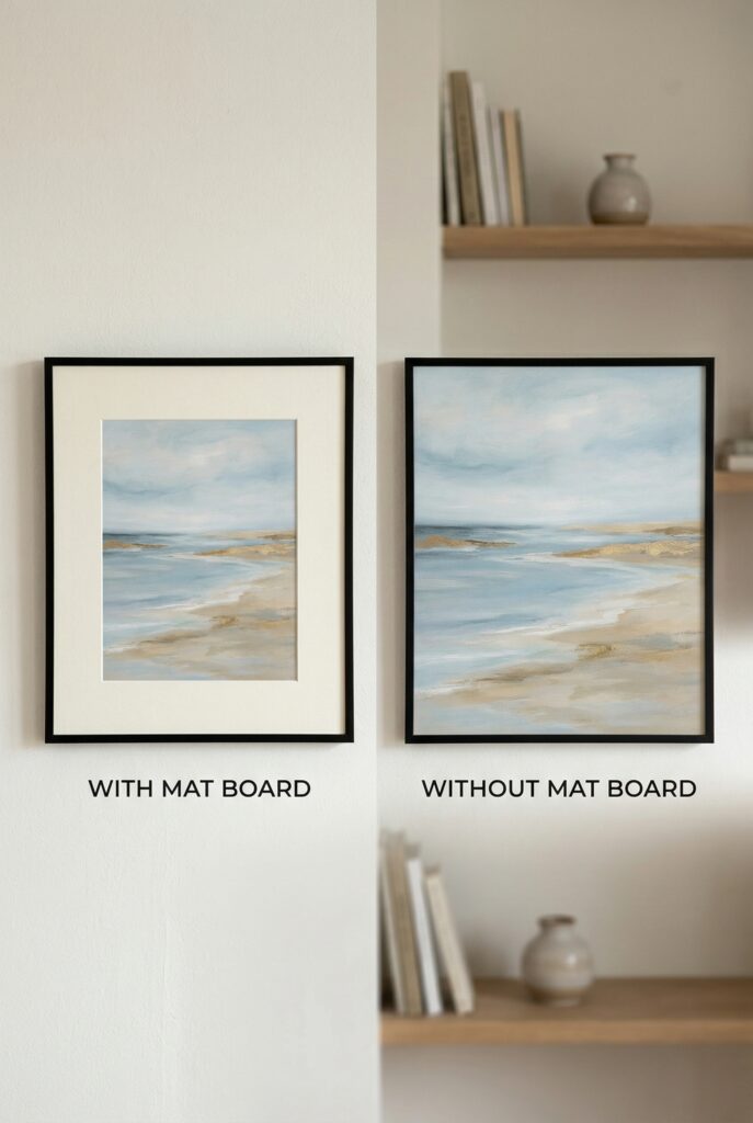
Mats (also called mats or mat boards) are the border between the art and the frame.
Use a mat when:
- The art is smaller than the frame
- You want to create visual breathing room
- The art has fine details that need separation from the frame
- You’re framing photos or prints (mats add a professional look)
Skip the mat when:
- You want a modern, edge-to-edge look
- The art is already the exact size of the frame
- You’re framing posters or graphic prints that work well without borders
Mat color:
- White or cream: Classic, works with everything
- Black: Dramatic, best with black and white art
- Colored mats: Risky — only use if the color appears in the artwork
Mat width:
- 2-3 inches: Standard, works for most art
- 4+ inches: Museum-style, creates a gallery feel
- Uneven mats: Wider bottom mat (3-4 inches) with narrower sides (2 inches) — this is a traditional framing technique
FRAME PROFILE: THIN VS. THICK
Frame profile refers to the width and depth of the frame molding.
Thin frames (0.5-1 inch):
- Modern, minimal aesthetic
- Best for small to medium art
- Works in gallery walls where you want the art to dominate
Medium frames (1-2 inches):
- Versatile, works in most spaces
- Adds presence without overwhelming
- Best all-around choice
Thick frames (2+ inches):
- Traditional, substantial feel
- Best for large art or statement pieces
- Can overwhelm small prints
Pro tip: In a gallery wall, keep frame profiles consistent. Mixing thin and thick frames looks chaotic.
GLASS: REGULAR, NON-GLARE, OR ACRYLIC?
Most frames come with regular glass, but you have options.
Regular glass:
- Cheapest option
- Reflects light (can cause glare)
- Fine for most situations
Non-glare glass (museum glass):
- Reduces reflections
- Best for art in bright rooms or opposite windows
- More expensive but worth it for important pieces
Acrylic (plexiglass):
- Lightweight, shatter-resistant
- Best for large frames or homes with kids
- Scratches more easily than glass
UV-protective glass:
- Blocks UV rays that fade art over time
- Essential for valuable prints or original art
- Worth the investment for heirloom pieces
FRAME COLOR: MATCHING YOUR SPACE
Your frame color should tie into your room’s color palette.
Match your trim:
If your room has white trim, white frames blend seamlessly. If you have dark wood trim, wood frames echo that warmth.
Match your furniture:
Black frames pair well with black furniture or metal accents. Wood frames complement wood furniture.
Create contrast:
Black frames on white walls create crisp, modern contrast. White frames on dark walls create a gallery effect.
Stay consistent:
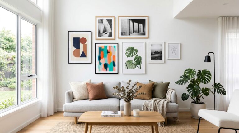
In a gallery wall, keep frame colors consistent (all black, all white, or all wood). Mixing frame colors works only if it’s intentional and balanced.
COMMON FRAME MISTAKES
1. Choosing frames that overpower the art
Ornate, decorative frames compete with the artwork. Unless you’re framing a mirror or going for a maximalist look, keep frames simple.
2. Mixing too many frame styles
In a gallery wall, mixing black and wood frames can work — but mixing black, white, gold, and silver looks chaotic. Pick one or two frame colors max.
3. Using cheap, flimsy frames
Cheap frames warp, the backing falls out, and the glass rattles. Invest in solid frames with proper backing and hanging hardware.
4. Ignoring the room’s style
Modern frames in a traditional space (or vice versa) create visual dissonance. Match the frame style to your room’s aesthetic.
QUICK REFERENCE GUIDE
For modern spaces:
- Black or white frames
- Thin to medium profile
- No mat or minimal white mat
For traditional spaces:
- Wood or gold frames
- Medium to thick profile
- Wide mats (3-4 inches)
For eclectic spaces:
- Mix of wood and black frames
- Varied profiles (but keep it balanced)
- Mats optional
For gallery walls:
- Consistent frame color (all black, all white, or all wood)
- Consistent frame profile
- Mix of frame sizes
WHERE TO BUY FRAMES
Budget-friendly:
- IKEA (Ribba and Silverhöjden frames)
- Target (Threshold frames)
- Amazon Basics
Mid-range:
- West Elm
- CB2
- Framebridge (online custom framing)
High-end:
- Room & Board
- Pottery Barn
- Local frame shops (best for custom work)
Pro tip: Buy standard sizes in bulk when they’re on sale. You’ll always need 8×10 and 11×14 frames.
THE PRACTICE
This week: take inventory of your current frames. Are they consistent? Do they match your space? If not, start replacing them one at a time.
Framing is an investment. Buy quality frames that will last, and your art will look better for it.
Ready to start your gallery wall? Read our gallery wall guide → (内链到 Gallery Wall 文章)
Looking for frame-worthy art? Browse art print sources → (内链到 Art Prints 页面)”