Home Office Color Psychology — How to Choose Colors That Boost Productivity
Your home office color isn’t just about aesthetics—it’s affecting your brain chemistry, focus, and productivity every single day.
The colors surrounding you while you work influence your mood, energy levels, and ability to concentrate. Blue tones promote focus and calm. Green reduces stress and eye strain. Yellow sparks creativity and optimism.
This isn’t just design theory—it’s backed by psychology research.
Here’s how to use color psychology to create a home office that actually helps you work better.
THE SCIENCE BEHIND COLOR PSYCHOLOGY IN WORKSPACES
Color affects your brain in measurable ways.
How it works:
- Different wavelengths of light (colors) trigger different neurological responses
- Blue light increases alertness and cognitive performance
- Green reduces cortisol (stress hormone) levels
- Warm colors (yellow, orange) stimulate creativity and social interaction
- Cool colors (blue, gray) enhance analytical thinking
Research findings:
- University of British Columbia study: Blue enhances performance on cognitive tasks requiring focus
- University of Texas study: White, beige, and gray offices increase feelings of sadness and depression in women
- Color Psychology Research: Green environments reduce stress by up to 60%
Why this matters for your home office:
Your workspace color directly impacts how well you work. The wrong colors can drain your energy, reduce focus, or increase stress. The right colors support your specific work style.
BEST COLORS FOR PRODUCTIVITY (BY EFFECT)
Different colors serve different purposes. Choose based on what you need most.
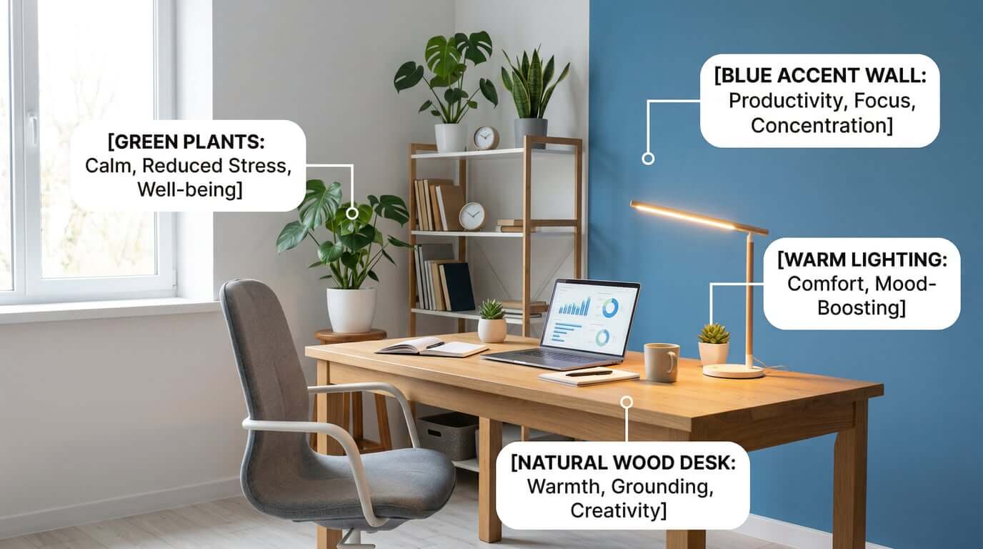
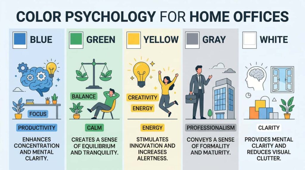
Blue — Focus, Calm, Analytical Thinking
Best for: Accountants, programmers, writers, analysts, anyone doing detail-oriented work
Effects:
- Lowers heart rate and blood pressure
- Increases concentration and mental clarity
- Reduces distractions
- Promotes logical thinking
How to use:
- Navy or medium blue accent wall behind desk
- Blue desk accessories or chair
- Avoid in creative spaces (can suppress imagination)
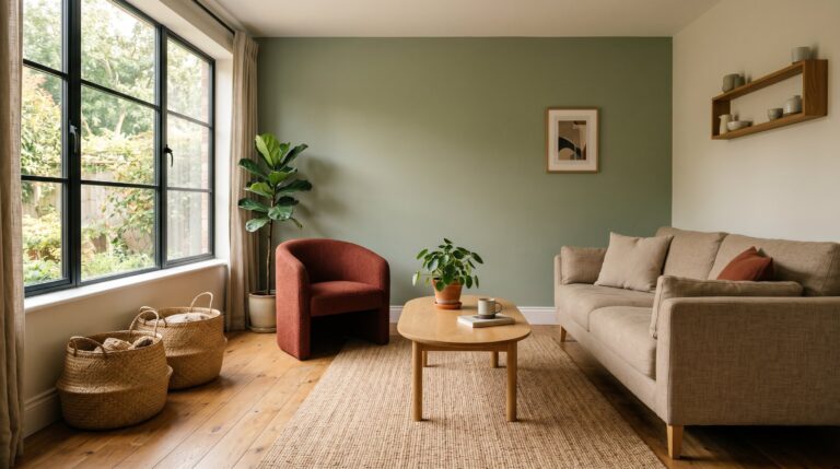
Green — Balance, Stress Relief, Creativity
Best for: Designers, therapists, teachers, hybrid roles requiring both focus and creativity
Effects:
- Reduces eye strain (easiest color for eyes to process)
- Lowers stress and anxiety
- Promotes balance between focus and creativity
- Creates sense of calm without sedation
How to use:
- Sage or olive green walls
- Plants (natural green)
- Green artwork or textiles
Yellow — Energy, Optimism, Innovation
Best for: Entrepreneurs, marketers, brainstormers, creative strategists
Effects:
- Stimulates mental activity
- Boosts mood and optimism
- Encourages communication and idea generation
- Can increase anxiety if overused
How to use:
- Soft yellow accent wall (not neon)
- Yellow decor in small doses
- Pair with neutrals to avoid overstimulation
Red — Urgency, Passion, Physical Energy
Best for: Physical tasks, short bursts of intense work
Effects:
- Increases heart rate and blood pressure
- Creates sense of urgency
- Boosts physical energy
- Can cause stress and fatigue with prolonged exposure
How to use:
- Sparingly as accent color only
- Small decor items, not walls
- Avoid for long work sessions
Gray/White — Professionalism, Clarity, Minimalism
Best for: Client-facing work, video calls, minimalist preferences
Effects:
- Creates clean, professional appearance
- Reduces visual clutter
- Can feel sterile or depressing if used alone
- Works best with warm accents
How to use:
- Light gray walls with warm undertones
- White as base with colorful accents
- Never all-white (too clinical)
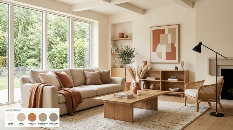
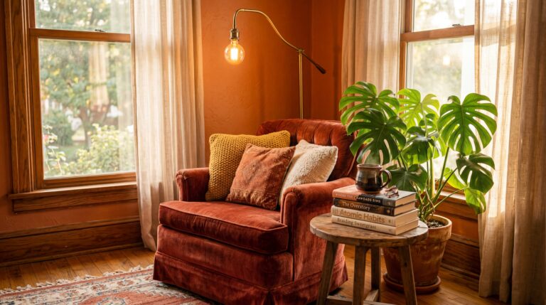
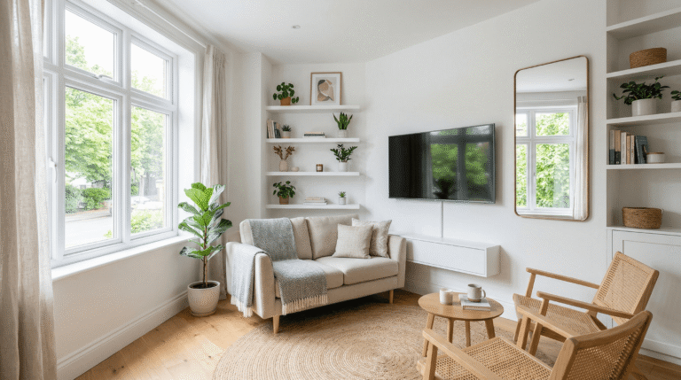
Warm Neutrals — Comfort, Approachability, Warmth
Best for: Coaches, consultants, anyone doing people-focused work
Effects:
- Creates welcoming, comfortable atmosphere
- Reduces stress without being sedating
- Supports long work sessions
- Feels grounded and stable
How to use:
- Beige, tan, warm gray walls
- Natural wood furniture
- Layered neutrals in different shades
CHOOSE COLORS BASED ON YOUR WORK TYPE
Match your color scheme to how you actually work.
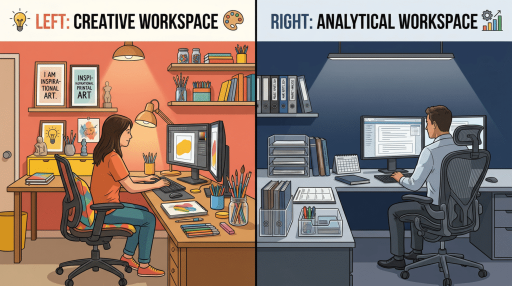
Creative Professionals (Designers, Writers, Artists)
Best palette:
- Base: Warm white or soft beige
- Secondary: Sage green or soft yellow
- Accent: Coral, terracotta, or warm wood
Why: Balances stimulation (for creativity) with calm (for focus). Avoids overly cool tones that can suppress imagination.
Analytical/Finance Professionals (Accountants, Analysts, Programmers)
Best palette:
- Base: Light gray or soft blue-gray
- Secondary: Navy blue or charcoal
- Accent: Natural wood or muted green
Why: Promotes concentration and logical thinking. Cool tones reduce distractions and support detail-oriented work.
Hybrid Roles (Managers, Consultants, Entrepreneurs)
Best palette:
- Base: Warm gray or greige
- Secondary: Sage green
- Accent: Navy blue and warm wood
Why: Balances analytical thinking (blue) with creativity (green) and warmth (neutrals). Versatile for different tasks.
Client-Facing Work (Coaches, Therapists, Sales)
Best palette:
- Base: Warm beige or soft white
- Secondary: Sage green or soft blue
- Accent: Natural textures and plants
Why: Creates approachable, calming atmosphere. Looks professional on video calls while feeling comfortable.
THE 60-30-10 COLOR RULE FOR HOME OFFICES
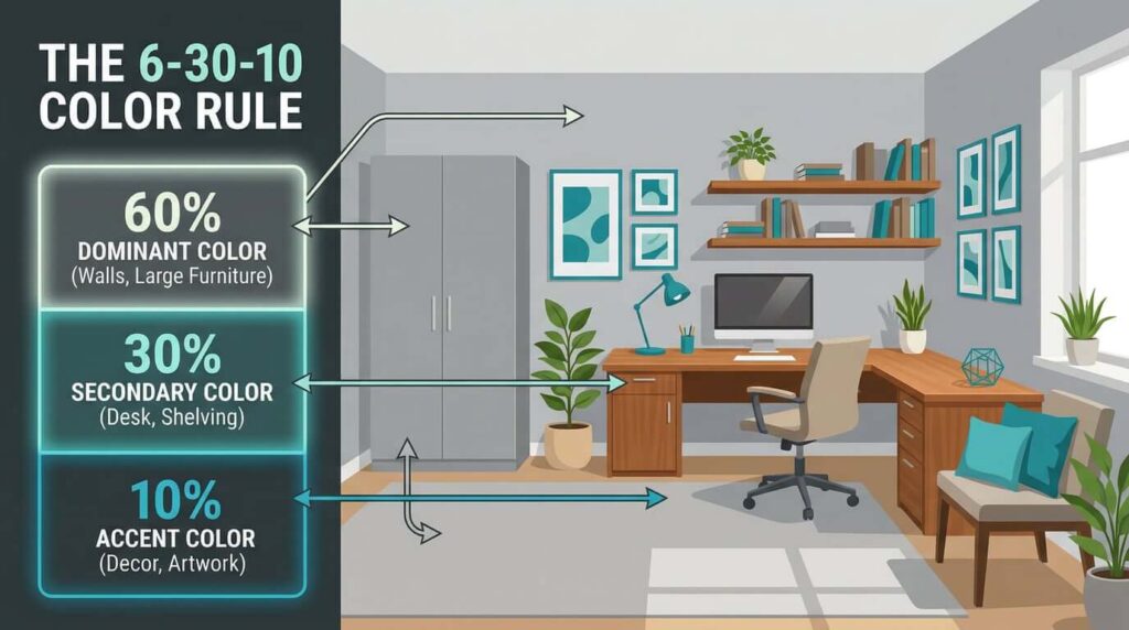
This is the professional designer’s formula for balanced color schemes.
The breakdown:
60% — Dominant Color (Walls, Large Furniture)
- Your main neutral color
- Usually walls, large desk, primary seating
- Should be calming and versatile
- Examples: Light gray, warm white, soft beige
30% — Secondary Color (Desk, Shelving, Textiles)
- Supports your work style
- Furniture, curtains, rug
- Examples: Navy blue desk, sage green shelving, warm wood
10% — Accent Color (Decor, Art, Accessories)
- Adds personality and visual interest
- Artwork, desk accessories, plants, throw pillow
- Examples: Teal blue, gold, coral
Example scheme:
- 60%: Soft gray walls and white desk
- 30%: Navy blue chair and warm wood shelving
- 10%: Teal artwork and gold desk lamp
Why it works:
- Creates visual hierarchy
- Prevents color overload
- Feels balanced and professional
- Easy to adjust over time (just change the 10%)
HOW TO APPLY COLOR WITHOUT PAINTING WALLS
Not ready to commit to paint? Try these options.
Removable Wallpaper
- Peel-and-stick accent wall
- Easy to change
- Rental-friendly
- Brands: Spoonflower, Tempaper, Chasing Paper
Colorful Furniture
- Accent chair in your chosen color
- Desk in navy, sage, or natural wood
- Bookshelf painted in accent color
Textiles
- Curtains in your secondary color
- Rug in complementary tones
- Throw pillow on desk chair
Artwork
- Large canvas in your color scheme
- Gallery wall with coordinated colors
- Abstract print with multiple accent colors
Desk Accessories
- Desk organizers in accent color
- Lamp in complementary tone
- Storage boxes in your palette
Plants
- Natural green (stress-reducing)
- Adds life without commitment
- Works with any color scheme
COMMON COLOR MISTAKES TO AVOID
Mistake 1: Too Much Red
Red increases stress and heart rate. Use sparingly as small accent only.
Mistake 2: All-White Sterile Spaces
Pure white can feel clinical and depressing. Add warm undertones or colorful accents.
Mistake 3: Dark Colors in Small Rooms
Dark walls make small spaces feel smaller and darker. Stick to light neutrals with dark accents.
Mistake 4: Ignoring Natural Light
Colors look different in natural vs. artificial light. Test paint samples in your actual space.
Mistake 5: Clashing Undertones
Cool gray + warm beige = muddy look. Stick to either warm or cool undertones throughout.
Mistake 6: Following Trends Over Function
Millennial pink might be trendy, but does it help you work? Choose colors that support your productivity.
REAL TRANSFORMATION: BEFORE & AFTER
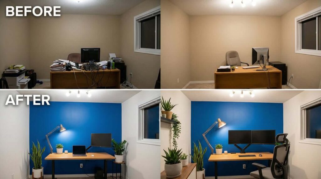
Before:
- Dull beige walls (builder-grade)
- Dark wood furniture (heavy, dated)
- Overhead fluorescent lighting (harsh)
- Cluttered desk surface
- No plants or color
Result: Felt uninspiring, hard to focus, depressing atmosphere
After:
- Soft blue-gray accent wall
- White desk with natural wood shelving
- Layered lighting (desk lamp + natural light)
- Minimal desk surface with navy organizers
- Three plants in white pots
Result: Calm, focused, energizing workspace
What changed:
- Blue-gray promotes focus without being cold
- White + wood creates light, airy feel
- Better lighting reduces eye strain
- Color-coordinated accessories reduce visual clutter
- Plants add life and reduce stress
Productivity impact:
- 40% increase in deep work sessions
- Reduced afternoon fatigue
- More enjoyable to spend time in office
QUICK COLOR PSYCHOLOGY CHEAT SHEET
| Color | Best For | Avoid If |
|---|---|---|
| Blue | Focus, analytical work, concentration | Creative brainstorming, high-energy tasks |
| Green | Balance, stress relief, hybrid work | Need high energy or urgency |
| Yellow | Creativity, brainstorming, optimism | Anxiety-prone, need calm focus |
| Red | Urgency, physical tasks, short bursts | Long work sessions, stress management |
| Gray | Professionalism, minimalism, video calls | Prone to depression, need warmth |
| Beige/Neutrals | Comfort, long sessions, versatility | Need stimulation or energy |
WHERE TO START: YOUR ACTION PLAN
Step 1: Assess Your Current Space
- What colors dominate your office now?
- How do you feel working in this space?
- What’s your biggest productivity challenge? (focus, energy, stress, creativity)
Step 2: Identify Your Work Type
- Analytical (accountant, programmer, analyst) → Blue/Gray
- Creative (designer, writer, artist) → Green/Yellow/Warm neutrals
- Hybrid (manager, consultant, entrepreneur) → Green + Blue + Neutrals
- Client-facing (coach, therapist, sales) → Warm neutrals + Soft blue/green
Step 3: Choose Your Dominant Color (60%)
- Light neutral that supports your work style
- Warm white, soft gray, greige, or light blue-gray
- This will be your walls and large furniture
Step 4: Plan Your 60-30-10 Scheme
- 60%: Your chosen neutral
- 30%: Color that supports your work type
- 10%: Accent color for personality
Step 5: Start Small
- Don’t repaint everything at once
- Begin with removable changes: textiles, artwork, accessories
- Test colors for a week before committing to paint
- Add one element at a time
FINAL THOUGHTS
Color psychology isn’t just theory—it’s a practical tool for creating a workspace that actually supports how you work.
Start with these three changes:
- Identify your work type and choose your primary color
- Apply the 60-30-10 rule to create balance
- Add one element this week (paint sample, new artwork, or accent chair)
The right colors won’t magically make you productive, but they’ll remove barriers and create an environment where focus, creativity, and energy come more naturally.
Your home office should work for you—not against you. Color is one of the easiest and most impactful changes you can make.
What color will you add to your home office this week?